One Love Collective
A UX/UI Case Study
SCOPE
3 Weeks
MY ROLE
UX/UI Designer
& Researcher
TEAM
5 Collaborators
One Love Collective is a Burlington-based network that empowers individuals with disabilities by organizing fun and inclusive activities that embrace their diverse needs. The group aims to help members make friends, share skills, and explore meaning and purpose in their lives. One Love Collective coordinates with local practitioners to offer services and classes to those with adaptive needs, with aspirations to expand their services to the greater Vermont community in the future.
Unfortunately, the organization's online presence has been limited to a single Facebook page, used to create events and connect with their target population. There was no way for non-Facebook users to sign up for events, no event calendar showing future events, and there was no way instructors create or share events on their own. To address this issue, the organization's founder reached out to our Burlington Code Academy cohort for help. We scheduled a kickoff meeting with the founder to learn more about the proposed project and identify ways to improve the organization’s online presence.
Our Mission
Create a full, original desktop website design that includes:
A homepage
An "Events" page with options to register, share, and create events
An “About Us” page
A "Contact" page
Social media links
A biography of each practitioner, along with a star rating system and testimonials
SKILLS & METHODS
TOOLS
Accessibility
User Interviews
Feature Analysis
Competitor Analysis
Persona
Empathy Map
MoSCoW Matrix
Wireframing
Prototyping
Usability Testing
Color Theory
Typography
Figma
FigJam
Canva
Research
Recruiting Users
Our team started the design process by crafting a comprehensive research plan. We carefully considered the information that we needed from our users and identified the necessary questions to ask during our virtual interviews. With help from our client, we reached out to several people involved with the organization and scheduled meetings accordingly. To accommodate those who preferred to submit their responses in writing, we also created an online questionnaire with the same set of questions.
During these interviews, our main goal was to gain an in-depth understanding of the organization's current functionality, identify important features that needed to be included, and determine how we could create a user-friendly website that would provide a delightful experience to the members of the community and meet their needs.
Feature and Competitor Analyses
As we waited for our virtual interviews to begin, our team took advantage of the time by conducting Feature and Competitor Analyses. Our aim was to gain further insight and inspiration into how our site should function, what features to prioritize, and how to organize our content. We conducted a feature audit of the current Facebook page, as well as several comparable websites. Additionally, we examined designs from other local organizations offering similar services and identified which elements were most valuable to our users.
We also explored websites such as Meetup.com and Airbnb, which we recognized as having similar functionality to what we wanted to create for One Love Collective, specifically filtered searches and event management features. To ensure we had a clear understanding of what elements and qualities to include in our design, we collected our findings and organized them into a MoSCoW matrix (Must Have, Should Have, Could Have, Won’t Have).
MoSCoW Matrix
User Interviews
As we began our interviews and received questionnaire responses, we found that communicating directly with users provided us with valuable feedback and ideas to move forward with. We were pleased to see the passion users had for the One Love Collective and the importance they placed on having an easy and convenient online experience.
During the interviews, we learned that caretakers play a significant role in scheduling and logistics when it comes to participating in events. We realized that a calendar would be essential, as well as having event details like date, time, duration, location, and accessibility requirements. We also recognized the importance of practitioner participation and making event creation as simple and engaging as possible in order to continue expanding the organization’s reach.
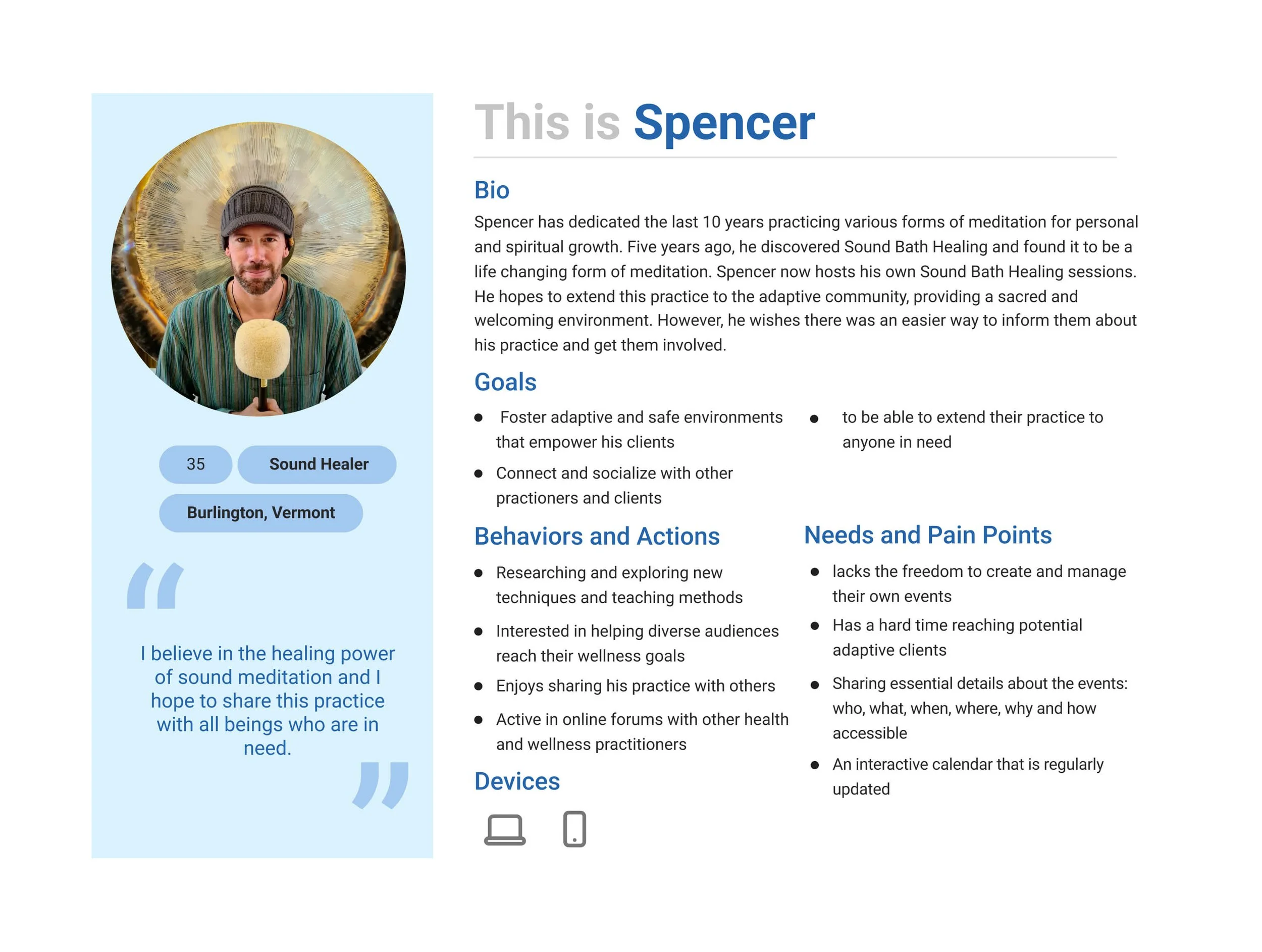
Personas
We discovered that there were two primary audiences our site would serve: care providers looking for activities for their clients, and professionals seeking to host classes and events. Accordingly, we made the decision to create two personas to represent our primary users.
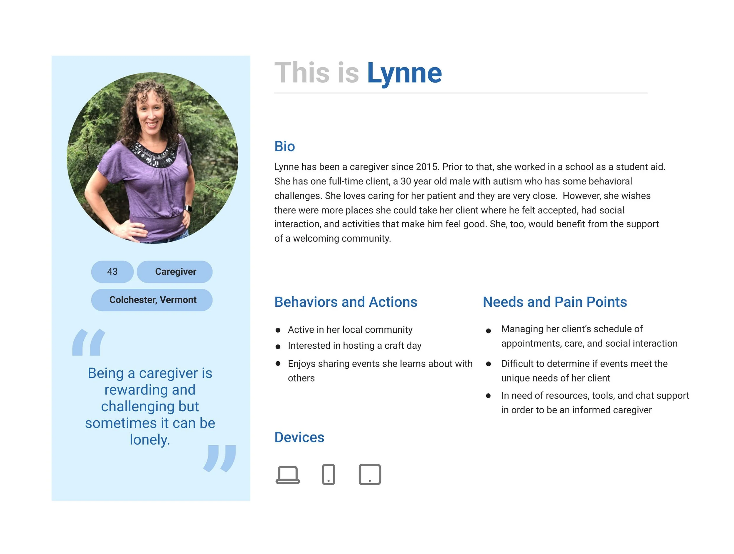
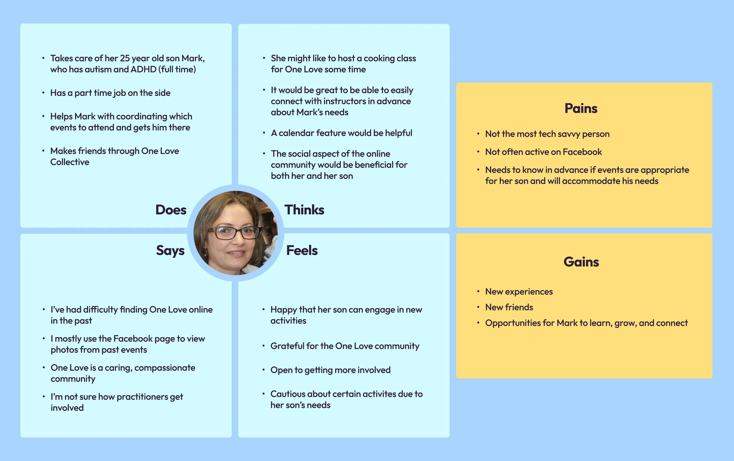
Empathy Map
We each crafted an empathy map to help us better understand the thoughts and feelings of our users. I created a caregiver empathy map, which we later incorporated into our deliverables.
Problem Statement:
With a thorough understanding of our users' needs, we were able to articulate a clear problem statement. This step was crucial in helping us recenter our thoughts as we transitioned from research to the design process.
One Love Collective community members need an inclusive online platform to connect, coordinate, and stay informed on fun, enpowering events that honor their needs.
Process
Wireframes
To begin, we created a few rounds of low-fidelity wireframes, which we sketched out individually and then discussed as a group. This process helped us align visually and gave us a starting point for our initial ideation. Once we reached a consensus on the general direction, we moved on to building medium-fidelity wireframes in grayscale for the four required pages (Home, Events, About, and Contact).
To prepare for the usability testing phase, we prioritized usability, accessibility, and clarity when creating our wireframes. We now needed to identify the most crucial tasks for testing, so we could transform the wireframes into a functional prototype. Based on our analysis and discussion with our client, we determined that the user’s primary goal would be to sign up for an event or create a new one. In turn, we added the necessary pages and interactive elements to our wireframes, along with relevant modals that would help us achieve our objectives.
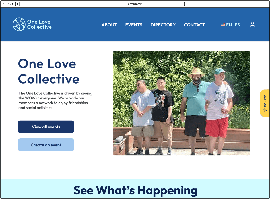
HOME
CONTACT
ABOUT
EVENTS
Try It Out:
Our Initial Prototype
User Testing
For the testing phase, we invited some of our previous interviewees to participate, and we conducted additional virtual meetings. During these sessions, we requested that participants share their screens and guide us through the assigned tasks. We were delighted to observe that all the individuals we tested with could effectively accomplish the tasks we had designed. Furthermore, we asked them some follow-up questions about their experiences, which provided valuable insights for the final stages of our design process. We knew we were on the right track!
Mockup
To build a design mockup, we deliberated on the critical visual elements, such as typography and color scheme. We landed on Outfit as our font choice for its easy-to-read and user-friendly design. For our color palette, we drew inspiration from the profile picture on the current Facebook page, which featured a sunflower. We found that sunflowers' cheerful and warm qualities were reminiscent of Burlington's summertime ambiance. The golden yellow shade we chose imbues a sense of playfulness, while the blue hues provide a calming and grounded effect.
Despite the tight schedule, we successfully expanded on our original design and incorporated additional pages that we had initially hoped to include. Ultimately, we developed not only the four mandatory pages but also an event details page, an event builder, a directory, a provider details page, and a profile/account page.
Try It Out:
Our Final Prototype
Results
After completing the mockups, we organized our deliverables and scheduled a final meeting with our client to showcase the finished design and hand off our files. We used Canva to create a presentation that emphasized our most significant findings and choices, and we guided the One Love Collective founder through the final mockup. We were pleased to receive excellent feedback from our client, who surprisingly did not have any queries or suggestions. He was enthusiastic about proceeding with development and simply wanted to know one thing: What had we learned from the experience?
FUTURE OPPORTUNITIES
KEY LEARNINGS
Design a blog page to inform users on recent happenings.
Design a forum for users to coordinate and connect with one another for support.
Meet with our Software Development cohort (who are in the process of developing the site) to get feedback.
Interview questions must be written carefully to optimize research findings and avoid influencing the participant.
How to coordinate the logistics of interviewing and testing in order to gather valuable insights from users.
How to create a complex interactive prototype.
How to conduct user testing sessions.
How to prepare a design for hand off to developers.